Advanced properties grid
The properties pane is the place where you can quickly set all the detailed properties of the selected element(s). Each element (such as question, answer, slide, video, and picture) has individual properties. It is not absolutely needed to use it as the most important settings can be accessed through the ribbon but for advanced users this may be a quicker way to get things done. (some more advanced/obscure properties can only be accessed from the properties pane). In the following chapters you will find an explanation of the most important properties. You can show the properties pane by going to the VIEW menu and putting a checkmark before ‘Properties’ (in the ‘Views’ section).
QuizXpress shows those properties in the properties panel, which you get by default, and still offers the classic property grid that earlier versions used. Both show exactly the same properties and you can switch between them whenever you like, so the chapters further down apply to either one.
The properties panel
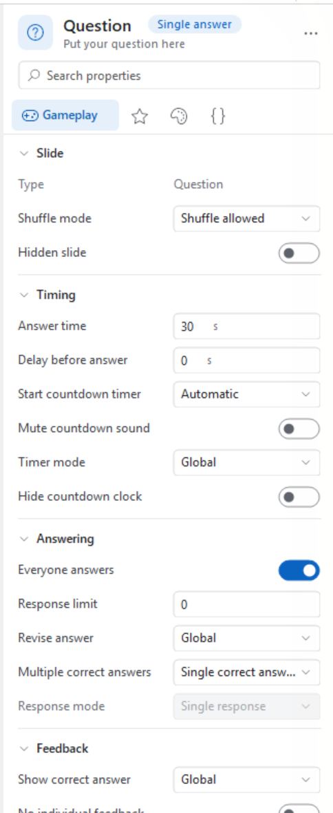
Instead of one long alphabetical list, the panel groups the properties of the selected element into pages and sections, and gives each property a control that fits it: a switch for a yes/no setting, a slider for a transparency, a colour swatch for a colour, and so on. Everything you change is applied to the slide straight away.
What is selected
The top of the panel tells you what you are editing: an icon, the type of the element, and a second line with its content (the text of an answer, the file name of a picture). When you select several elements at once — for example all four answers of a question — the title reads ‘4 objects selected’ and the panel shows the properties they have in common. Properties whose values differ between the selected elements are shown empty or as ‘Mixed’; as soon as you set one, all selected elements get the new value.
Pages
Under the search box is a row of pages: Gameplay, Scoring, Design, Text, Media and Advanced. Only the pages that actually have properties for the current selection are shown, and the page that matters most for the selected element comes first — the Text page for a text element, Gameplay for a quiz slide. The Advanced page (the {} tab) collects the technical properties: metadata, mobile device settings and scripting. Click a tab to switch pages; the panel remembers your choice per type of element.
Sections and more options
Each page is divided into sections such as ‘Timing’, ‘Answering’ or ‘Border’. Click a section title to fold it away, and use Expand all sections / Collapse all sections in the options menu to do all of them at once. Sections that also contain rarely used properties show a More options link at the bottom; click it to reveal them and Fewer options to hide them again. The panel remembers which sections you collapsed and which ones show their extra options.
Finding a property
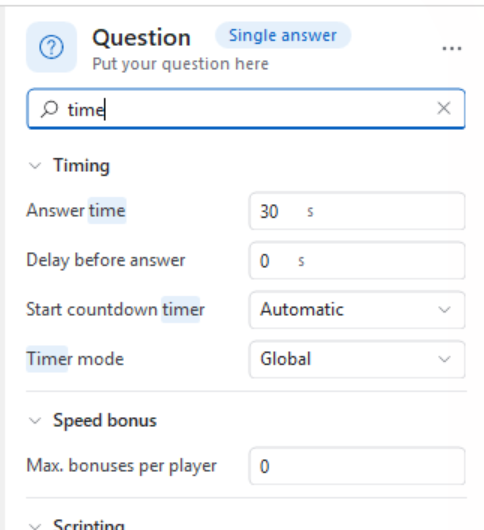
If you don’t know where a property lives, type a word in the search box at the top (or press Ctrl+F). The panel then shows every matching property from every page at once, with the matching part of the name highlighted. The search also looks in the descriptions, so a word that only appears in the explanation of a property still finds it. Click the ✕ in the search box to go back to the normal view.
Changing values
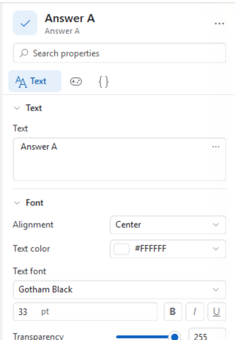
Most properties speak for themselves: type in a box, flip a switch, pick from a drop-down list. A few are worth pointing out.
Numbers can be typed, stepped with the small arrows at the right of the box, or — often quicker — changed by dragging the name of the property left and right. Hold Shift while dragging for bigger steps and Alt for finer ones. Properties that have a sensible minimum and maximum, such as a transparency, get a slider with a number box next to it; both stay in step with each other.
Fonts are set with a drop-down that previews every installed font, a size box, and buttons for bold, italic and underline.
Grouped properties such as a gradient or a size show a summary on one line. Click the name of the property to fold the individual settings (for a gradient: From, To and Type) open underneath it.
Colours
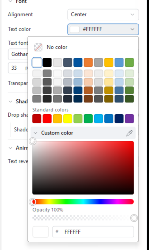
A colour property shows a swatch with its hex value. Click it and you get:
- No color, for properties that may be left empty (a transparent background, for example).
- A palette of shades on top and a row of Standard colors below it.
- Recent colors — the colours you used earlier, so repeating a colour across several elements takes one click. These are remembered for as long as QuizXpress Studio is running.
- Custom color, which folds open a saturation/brightness square, a hue bar, an opacity bar and a box where you can type or paste a hex value such as
#1E4A6B.
The small pipette at the right of the ‘Custom color’ title picks a colour from anywhere on your screen — also from outside QuizXpress. Click it and the screen freezes; a magnifier follows your mouse and shows the individual pixels with the colour under the cursor. Click to take that colour, use the arrow keys to move one pixel at a time (hold Shift for ten), or press Esc to cancel. Because the screen has no transparency, the opacity of the colour you had is kept.
Gradients
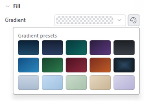
A gradient property shows a preview of the gradient. Next to it is a palette button that opens a set of ready-made gradient presets — one click gives a slide background or a text box a finished look. To keep a gradient you made yourself, right-click the gradient property and choose Add to my gradients; it then appears under My gradients in the picker (up to five). Right-click one of your own gradients in the picker to remove it again. Your gradients are kept between sessions.
Reset, copy and paste
Right-click any property for:
- Reset to default — puts the property back to the value it has in a new slide.
- Copy value and Paste value — handy for moving a colour, a font or a gradient from one element to another. Ctrl+C and Ctrl+V do the same for the property you are working in, so you can copy a colour here and paste it straight into another program as
#1E4A6B, or the other way round.
Descriptions
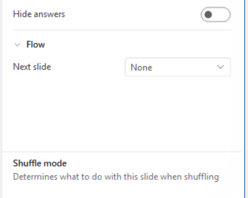
Hovering over the name of a property shows a tooltip explaining what it does. If you would rather have that explanation permanently in view, switch on Show descriptions in the options menu: a bar then appears at the bottom of the panel with the name and the explanation of the property your mouse is on.
Options
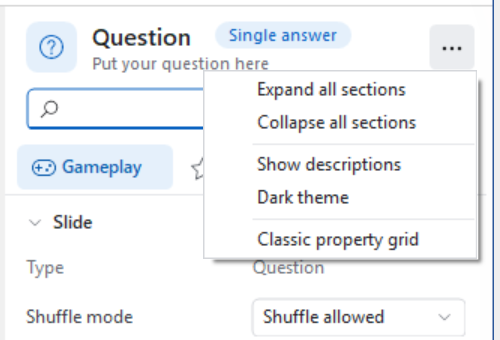
The … button in the top right corner of the panel holds the settings for the panel itself: expanding and collapsing all sections, showing descriptions, the dark theme, and switching to the classic property grid.
Dark theme
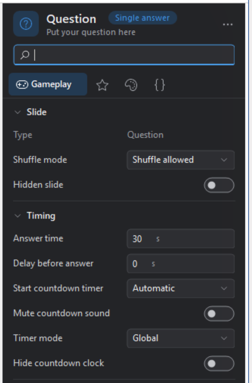
Dark theme in the options menu gives the panel a dark colour scheme, which is easier on the eyes when you are designing light slides or working in a dimly lit room. The choice is remembered the next time you start QuizXpress Studio, and only affects the properties panel.
The classic property grid
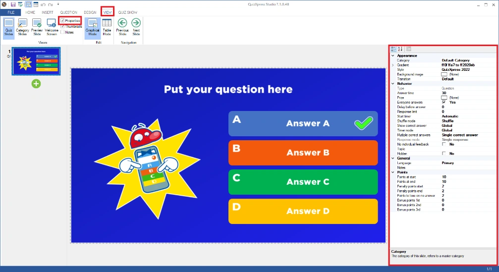
The grid that earlier versions of QuizXpress used is still there. It lists all properties of the selected element in alphabetical groups and is the quickest way to see everything at once. Choose Classic property grid from the … menu of the properties panel to switch to it, and the Switch to the new properties panel button at the right of the grid’s own toolbar to come back. QuizXpress remembers which of the two you prefer.
Quiz slide properties
These properties are shown by clicking on the background of a question. The properties are split in different groups:
-
Appearance, defining how the question is rendered.
-
Behavior, defining the behavior of the question during the game show.
-
General, general properties.
-
Metadata, metadata for this slide (Id and Class)
-
Points, points assignment section.
* visibility of the property depends on other properties |
Question properties
These properties are shown when clicking on the question box on a slide
| Property | Description |
|---|---|
| Alignment | The text alignment of the question text |
| Drop shadow | Indicates whether a shadow is imposed under the question text |
| Gradient | The gradient fill for the background of the question. |
| Shadow color | Indicates the color of the shadow |
| Text | The text of the question |
| Text Color | The color of the question text |
| Text font | The font used for the question text |
| Text reveal animation | How is the text revealed. Show (default: shows directly), Show letter by letter or Show word by word |
| Text reveal delay (sec) | The delay after which the text is shown |
| Text reveal speed | Speed of the text reveal |
| Transparency | Transparency of the background of the question |
Answer properties
These properties are shown when clicking on an answer box on a slide
| Property | Description | |
|---|---|---|
| Alignment | The text alignment of the answer text | |
| Correct answer | Indicates whether the selected answer is the correct answer. Set to ‘true’ if the selected answer is the correct answer. | |
| Correctness | Applicable for questions with multiple correct answers, this value sets the correctness (as a percentage of the total question points) of the answer. | |
| Drop shadow | Indicates whether a shadow is imposed under the question text | |
| Gradient | The gradient fill for the background of the question. Whether this property is applicable depends on the style used. | |
| Shadow color | The color of the drop shadow | |
| Text | The text of the answer | |
| Text reveal animation | How is the text revealed. Show (default: shows directly), Show letter by letter or Show word by word | |
| Text reveal delay (sec) | The delay after which the text is shown | |
| Text reveal speed | Speed of the text reveal | |
| Text color | The color of the answer text | |
| Text font | The font of the answer text | |
| Transparency | Transparency of the background of the answer panel |
Picture properties
These properties are shown when clicking on a picture box on a slide
| Property | Description |
|---|---|
| Border | Indicates whether a border is drawn around the picture |
| Border color | The color of the border, when enabled |
| Border thickness | Thickness in pixels of the border (when enabled) |
| Corner radius | Corner radius for the border line to create a rounded border |
| Correct answer | Indicates whether the picture contains the correct answer. This can only be set for pictures when the slide contains only pictures and is a multiple-choice slide. |
| Drop shadow | Indicates whether a shadow is imposed under the picture |
| Effect | Sets an effect on the picture. See Cropping for a more detailed explanation about effects. |
| Hidden | Hide the picture during the quiz |
| Hidden on mobile | Indicates if a picture shown on a quiz slide should be hidden on the mobile phone. One scenario for using this is when you want to show a different picture on the mobile phone than on the big screen for the audience. For example, you might want the mobile picture to have a different aspect ratio. In that case, you don’t want the picture shown on the big screen to also appear on the mobile phone. |
| Image | A thumbnail of the image. Click the browse (…) button of this property to browse for a picture. |
| Inflate | Determines if the picture should fill the entire area by zooming in |
| Label | A textual description for the picture (used when the picture cannot be shown) |
| Mobile device image | An alternative version of the image to be used on mobile devices |
| Stretch | Stretch the image in both directions to fill the area (may distort the image) |
Sound properties
These properties are shown when clicking on a sound item on a slide
| Property | Description |
|---|---|
| Duration | The duration of the sound. Initially the full duration is shown. |
| Intro pause | The time to wait before the sound starts. This gives the quizmaster the possibility to first read the question. |
| Keep playing | By default, the music you put on a slide stops when the countdown timer ends. With this flag, you can let the music play until you move to the next slide. |
| Pitch | The pitch at the start of the countdown |
| Remove vocals | Effect to remove vocals (may yield mixed results) |
| Repeat | Indicates whether the sound should repeat itself. |
| Replay | Replays the sound after the correct answer has been revealed in the question. |
| Replay delay | Shown when replay is enabled. Shows the number of seconds after which the repeat begins |
| Replay start | Sets the time where the sound fragment will start playing |
| Replay end | Sets the time where the sound fragment will stop playing |
| Reverse audio | Play the sound fragment reversed |
| Sound Storage Type | Indicates if the sound data is stored embedded in the quiz file or on the local disk (linked) |
| Speed percentage | The speed of the sound when it starts playing. |
| Start at | The position in the sound file from which the sound will be started. |
| Stop at | The time to stop the sound |
| Target Pitch | The pitch at the end of the countdown (pitch will interpolate from start to end) |
| Target speed percentage | The speed of the sound when it ends playing. Note: by playing with the ‘speed percentage’ and ‘target speed percentage’ it is possible to play sounds ‘from slow to normal’ or ‘from fast to normal’. Setting both percentages to 100% just plays the sound fragment from start to end at normal speed. |
| Volume | The volume at which to play the music |
| Volume fade | Fade in/out when starting/stopping the music |
Mini game properties
| Property | Description |
|---|---|
| Minigame title | By default the mobile buzzer shows the name of the minigame on screen. You can override this and provide your own text. So instead of seeing “Horse race”, you can now show something more exciting. |
Video properties
These properties are shown when clicking on a video on a slide
| Property | Description |
|---|---|
| Aspect Ratio | (read-only) aspect ratio |
| Codec | (read-only) video decoder being used |
| Duration | (read-only) length of the video |
| Effect | Optional effect on the video |
| End | Time to end the video |
| Intro Pause | Delay between showing the slide and starting the video |
| Linked File | Filename of the external video file if linked |
| Loop | Repeat the video after it stopped |
| Replay | Replays the video after the correct answer has been revealed in the question. |
| Replay delay | The number of seconds after which the repeat begins |
| Replay start | Sets the playback time where the video will start |
| Replay end | Sets the playback time where the video will end |
| Silent | Suppress the sound in the video |
| Start | Time to start the video |
| Video Height | (read-only) height of the video |
| Video storage type | Indicates whether the video fragment is embedded or linked. Embedding a video fragment into a quiz means the video fragment is incorporated into the quiz file. Linking a video fragment means a reference is made from the quiz file to a video on the file system. In general, linking videos is recommended. Note: when linking videos, be sure not to remove the video files from your file system. When moving the quiz to a different computer, the videos must be copied into the same folder as the quiz file. |
| (read-only) width of the video | (read only) width of the video |
Shape properties
These properties are shown when clicking on a picture shape or text shape on a slide.
| Property | Description |
|---|---|
| Alignment | The text alignment of the text shape |
| Background transparency | Applicable for text shapes. Sets the transparency of the color used for the background (the Gradient property). |
| Border color | The border color of a text shape |
| Border width | The width of the border of a text shape |
| Corner radius | The radius of the border of a text shape. Allows you to make rounded corners. |
| Drop shadow | Indicates whether to use a drop shadow for a text shape |
| Gradient | The gradient fill for the background of a text shape. A gradient ‘from’ color and a gradient ‘to’ color can be selected as well as a gradient type. |
| Picture | Applicable for picture shapes. A thumbnail of the image. Click the browse (…) button to browse for a picture. |
| Rotation Angle | The rotation angle of the picture or text |
| Shadow color | Shadow color of the drop shadow for a text shape |
| Stretch | Applicable for picture shapes. Stretches the picture to cover the full area of the surrounding selection box |
| Text | The text of the text shape |
| Text color | The color of the text of a text shape |
| Text font | The font used for the text shape |
| Transparency | Set the transparency of the picture or text |
| Visibility | Indicates whether a shape (being either a picture or text) is always visible, becomes visible when an answer is revealed, is hidden when an answer is revealed, or is timed (appears at a certain point in time during the countdown). |
Speech properties
These properties are shown when clicking on a speech item on a slide.
| Property | Description |
|---|---|
| PreRoll | Indicates the number of seconds to wait before the speech starts |
| Rate | The speed at which the text of the speech item is read |
| Text | The text to be read |
| Voice | The voice to use (choose one from the installed voices in Windows) |
| Volume | The volume of the spoken text |
Chart properties
These properties are shown when clicking on a chart on a slide
| Property | Description |
|---|---|
| Alignment | Alignment of the title of the chart |
| Area background | Set the background color of the chart data area |
| Axis color | The color used for the axis |
| Axis label autosize | Automatically set the size of the labels on the axis. If not set, you can explicitly choose a font and size for the labels |
| Axis label color | The color used for the labels on the axis |
| Chart background | Set the background color of the area outside of the chart data |
| Chart type | The type of chart. Choose between Bar, Column, Doughnut, or Pie. |
| Corner radius | Radius of the corners of the chart element |
| Dropshadow offset | Show a drop shadow for the chart data area |
| Grid color | The color used for the grid in the chart data area |
| Label color | Color of the labels shown for each element in the chart |
| Label display mode | For the labels, show absolute values, percentages or both |
| Label font | Font of the labels |
| Label style | Indicates where to position the labels |
| Mode | Indicates the type of data that is shown in the chart: response (percentage of each answer given) or right/wrong (percentage of players that were right/wrong) |
| Show 3D | Show a 3D representation of the chart |
| Show legend | Show a legend for the chart data (percentage of responses for each answer) |
| Title | Title of the chart |
| Title color | Color of the title of the chart |
| Title font | Font of the title of the chart |
| Visibility | Indicates whether the chart is always visible (with live updates during countdown) or only after the question closes |
Word game properties
These properties are shown when clicking on a word game on a slide
| Property | Description |
|---|---|
| Alignment | Alignment of the text |
| Background fill | The gradient fill for the background of the word game. A gradient ‘from’ color and a gradient ‘to’ color can be selected as well as a gradient type. |
| Center index | For a word wheel game, indicates the letter which appears in the center |
| Drop shadow | Indicates whether to use a drop shadow for the letters in the word game |
| End reveal at | Percentage of the countdown time when the reveal ends |
| Font | The font used for the text |
| Interval | For unscramble and reveal word games, control the time between the steps in the game: linear, slowing down, or slowing down a lot. |
| Layout | For reveal or unscramble word games: dynamic letter grid or fixed letter grid with 52 cells. |
| Letter background fill | The gradient fill for the background of the letter boxes in the word game. A gradient ‘from’ color and a gradient ‘to’ color can be selected as well as a gradient type. |
| Letter corner radius | Radius for the corners of the word game |
| Letter spacing | Space between the letters in the word game |
| Manual control | Indicates if letters are revealed automatically or if they are manually revealed by the quiz master from QuizXpress Director |
| Padding | Padding around the letters of the grid |
| Reverse | For a word wheel game, reverse the direction of the letters |
| Shadow color | Color of the drop shadow for the letters |
| Spin | Spin the letters in the word wheel around for an extra challenge |
| Start angle | For a word wheel game, the start angle where the first letter of the word appears |
| Start reveal at | Percentage of the countdown time when the reveal starts |
| Text | The text of the word game |
| Text color | The text color of the text |
| Text transparency | The text transparency of the text |
Trivia Board properties
These properties are shown when a trivia board is selected.
| Property | Description |
|---|---|
| Auto select | Automatically select a random tile when the board is selected with an animation |
| Animation duration (sec) | Duration in seconds of the random selection animation |
| Animation interval (sec) | Interval between changing the selection during the random selection animation |
| Background color (Topic Tiles) | Set the background color of the topic tiles |
| Background color (Question Tiles) | Set the background color of the question tiles |
| Button margin | Set the margin between the buttons |
| Circular tiles (Topic tiles) | Make the tiles circular (default is rectangular) |
| Font (Topic Tiles) | Set the font of the topic tiles |
| Font (Question Tiles) | Set the font of the question tiles |
| Hide buttons | Hide button if no questions are left for the topic or points |
| Max. questions to play | The maximum number of questions to play or 0 for all questions |
| Randomize questions | If multiple questions are linked to a tile, one will be selected at random. However, if the ‘Randomize questions’ option is not enabled, the questions behind the tile will be presented in the order they appear in the quiz. |
| Text color (Question Tiles) | Set the text color of the question tiles |
| Text color (Topic Tiles) | Set the text color of the topic tiles |
| Topics only | Only show topics on the board |
Trivia Ladder properties
These properties are shown when a Trivia Ladder slide is selected.
| Property | Description |
|---|---|
| Background color | Set the background color of the trivia ladder |
| Background image | Set the background image of the ladder |
| Background stretch mode | Stretch mode of the background image |
| Border color | Set the color of the trivia ladder border |
| Display mode | Where to show the ladder on the screen: slide in from the right of the screen, slide into the center of the screen, show full screen, or always show it (on the right-hand side of the screen). |
| Keypads color | Set the color of the keypads |
| Safety net color | Set the color of the safety net steps |
| Separator color | Set the color of the separators |
| Show border | Show the border of the trivia ladder |
| Step color | Set the color of the steps |
| Wrong answer action | Indicates what to do when a player answers incorrectly: go one step down, stay on the same step, restart on the ladder, or fall back to the nearest safety net. |
Bingo properties
When configuring your Bingo game, the following properties are available:
| Property | Description |
|---|---|
| Auto advance after claim | When a claim is handled on screen and that option is enabled, the game will continue automatically after the claim. If not, the game waits for the host to press Next. |
| Blanks per row | The number of blank cells per row on the bingo card. This can be used to speed up the game |
| Center Image | The center (bonus) image to appear on the mobile Bingo card |
| Claims mode | Indicates if only the first player to claim bingo is handled or all players |
| Countdown time (sec) | The countdown time when handling a bingo claim onscreen. |
| Enable Virtual Caller | Enable the Windows voice synthesizer to call out the balls/colors for a regular Bingo game |
| False Bingo handling | How false bingos are handled (in front of the audience, or silently) |
| False Bingo limit | How many times can a player claim a bingo before they are excluded |
| False Bingo mode | What happens when a player claims a false Bingo |
| First Pattern…Fifth Pattern | The patterns to play for (up to 5 patterns can be played in one round) |
| Game Type | Trivia Bingo, Number (traditional) Bingo, or Emoji Bingo. |
| Pattern penalty points | The points to lose for a false bingo (per pattern) |
| Pattern Points | The points to win for a valid bingo (per pattern) |
| Randomize questions | When playing Trivia Bingo, this flag indicates that the questions are played in random order |
| Say Colors | Say the column colors with the numbers (for example ‘Blue 4’) |
Trivia Feud properties
When configuring a Trivia Feud slide, the following properties are available:
| Property | Description |
|---|---|
| Auto scale text | Scale the text of the answers so they fit in the boxes (results in different font sizes for the answers) |
| Drop shadow | Add a drop shadow to the answer texts |
| Leading zeros | Show leading zeros for the survey scores |
| Question font | Font of the survey question |
| Question text color | Color of the survey question |
| Show light grid | Show the light grid on the background |
| Survey | Edit the survey answers |
| Survey question | Edit the survey questions |
| Survey text alignment | Alignment of the survey text |
| Survey text color | Color of the survey answers |
| Game mode | Manual, Fastest Finger, Multiplayer |
| Hide survey question | Hide the survey question (quizmaster prefers to read it out) |
| Max correct answers | The maximum number of correct answers a player can give (fastest finger only). |
| Max incorrect answers | The maximum number of incorrect answers that a player may give before countdown resumes (fastest finger mode) The maximum number of incorrect answers before the turn goes to the other team (manual mode) |
| Penalty points | The number of penalty points when a given answer is incorrect (fastest finger mode) |
| Points multiplier | Apply a multiplier of 2 or 3 to the survey answers so a player can win 2 or 3 times as many points |
| Reveal order | The order in which the remaining panels are revealed (‘first to last’ or ‘last to first’) |
| Reveal delay (ms) | The delay in milliseconds between revealing each survey answer. Enables the host to read out the answers one by one while they are shown. |
| Wrong answer mode | When a player answered a number of incorrect answers as defined in ‘max incorrect answers’, indicate with this mode whether a player is excluded for this question or may buzz in (continue) again (fastest finger mode) |